National Sickie Day
 Published: 2018-02-19
The first Monday in February has apparently become known as national sickie day in the UK. Mondays are generally associated with general gloom and are often quoted as the day of the week that people most often would, or would like to, pull a sickie. In 2016, National Sickie Day was also the first of the month.
The reason for pulling a sickie often reported in surveys, apart from actually being ill of course, is the weather. With the weather this January being pretty miserable/cold, it seemed interesting to analyse Manta data to see if Monday February 1st was a bad day for businesses in terms of staff being off ill, but also generally looking at sickness levels over January and if there is a Monday trend.
According to the Centre for Economics and Business Research (CEBR), sick employees cost the UK private sector £4.17bn each year. It not only costs the business and the economy money, but it often puts an additional unfair burden on team members who do bother to make it in and have to take up the slack.
After school night work drinks it is normally the unwritten rule that you must make it in the next day, however bad the hangover is. Extra kudos points for the colleague who gets in a round of bacon sarnies. A few years ago it seemed popular in America to offer an official allowance of ‘duvet days’ that could be called upon at the last minute when the partying the night before went a bit too well. However, I have not really seen this taken off in the UK- more specifically, anywhere I have worked.
The chart below shows the standard sick day heatmap from Manta, but averaged across all companies. i.e. the darker the square, the bigger percentage of staff who were off sick that day.
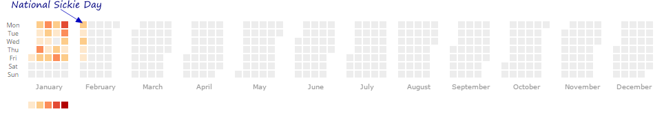
Monday February 1st, aka National Sickie Day, does not seem to be a particular thing within the Manta community. However, Mondays generally do seem to have a high proportion of people off work due to sickness.
What about the weather? January was a pretty cold month. Below is a composite chart showing the average low temperature during January and a relative indication of the number of people off sick.
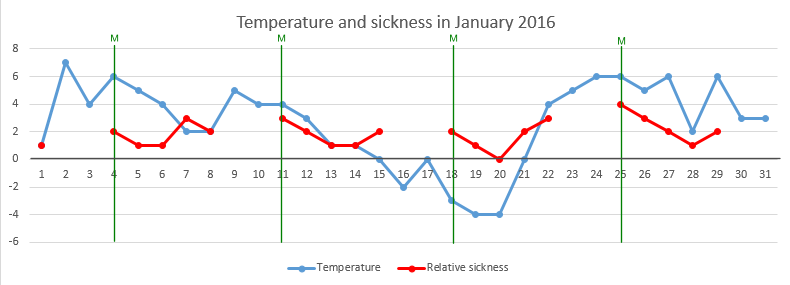
It is quite hard to identify a strong correlation with this dataset, apart from it does seem to suggest that the percentage of people off increases after a particular cold spell rather than during one. I am not sure this quick chart would hold up in any scientific journal, so I think I will leave it at that. Forecast for another cold week next week – might be worth investing in a warmer duvet.